

Basic & Closing Slides
The Basic shelf of the slide-type picker holds the slides most decks are built from: an opener, section breaks, text, lists, quotes and callouts. The Other shelf adds the slides that close a deck and a free-form HTML slide. Every field, with its limits, is in the slide-type reference.
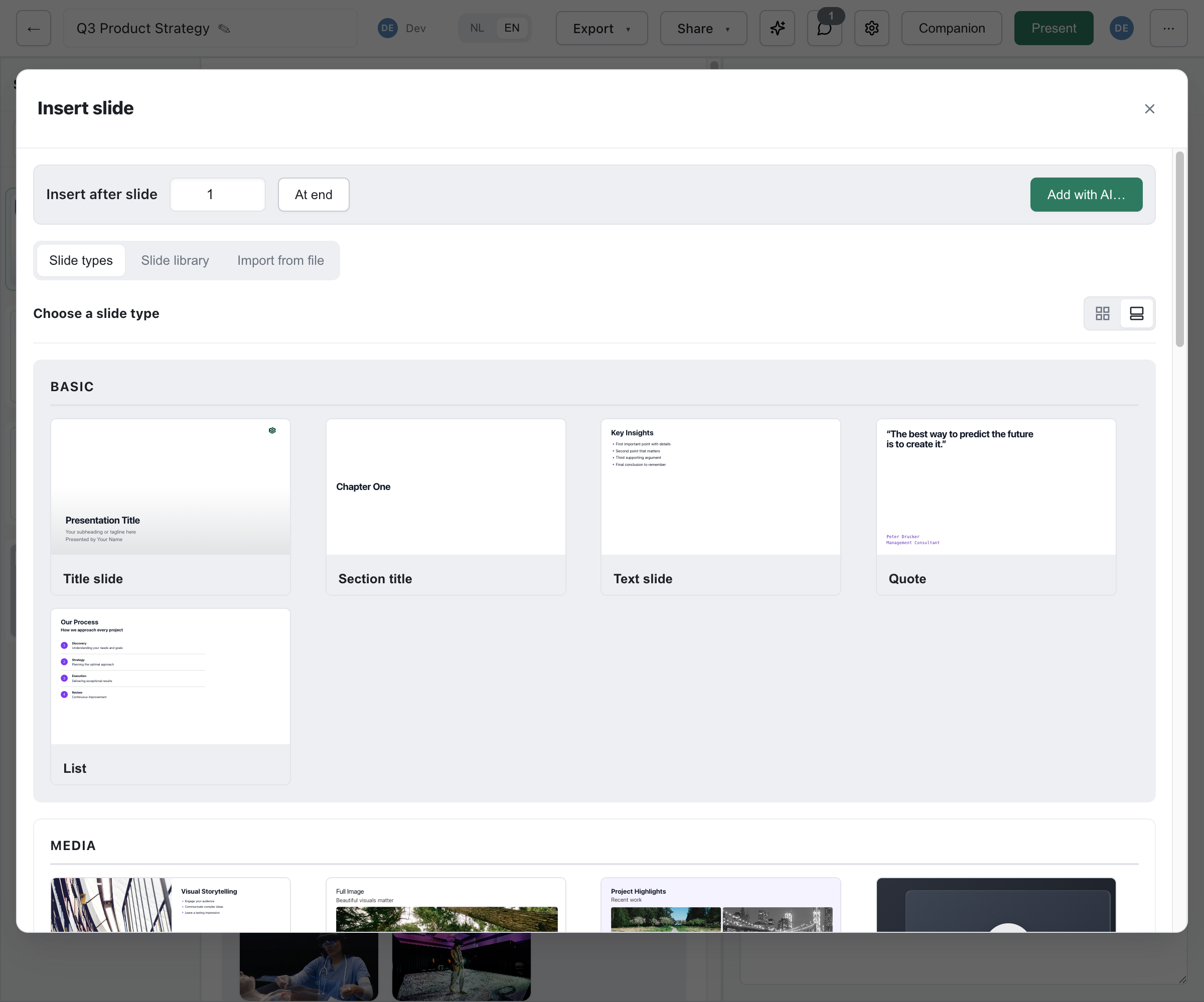
Title Slide
Section titled “Title Slide”The opening slide of your presentation.
| Field | Required | Description |
|---|---|---|
title | Yes | Main title (max 120 chars) |
subheading | No | Subtitle (max 160 chars) |
meta | No | A line for presenter, date or event (max 160 chars) |
titleBlockAlign | No | left or center |
logoCorner | No | Corner for the theme logo: left or right (default) |
background | No | lime or mist |
- Theme logo - The slide shows the theme’s title logo, or its main logo when the theme has no separate title logo.
- Background image - Use the slide background fields that every type carries (
slideBgImagewith its overlay and text-colour options).
Section Title
Section titled “Section Title”Section dividers that break your presentation into parts. In the data this is chapter-title-slide.
| Field | Required | Description |
|---|---|---|
title | Yes | Section title (max 140 chars) |
subheading | No | Short description (max 160 chars) |
layout | No | Vertical position of the title: top, center (default) or bottom |
titleBlockAlign | No | left or center |
Text Slide
Section titled “Text Slide”The workhorse slide for text: a heading with a Markdown body (content-slide).
| Field | Required | Description |
|---|---|---|
title | Yes | Slide title (max 120 chars) |
subheading | No | Subtitle (max 200 chars) |
body | Yes | Body text in Markdown (max 3000 chars) |
layout | No | one-column (default) or two-column |
density | No | Text size: auto or compact |
asideVariant, asideText | No | A short aside next to the body: note, tip or warning |
actions | No | Up to three buttons |
background | No | lime or mist |
The body supports bold, italic, bulleted and numbered lists, links, inline code and blockquotes. Each action button has a label (max 40 chars), a URL and a style: primary, secondary or outline.
The layout switcher also offers image layouts. Choosing one converts the slide to an Image + text or Images + text slide and keeps your text.
A bulleted or numbered list of 2 to 8 items (list-slide). The picker offers it twice, as Bullet list and Numbered list.
| Field | Required | Description |
|---|---|---|
title | Yes | Slide title (max 120 chars) |
subheading | No | Subtitle (max 160 chars) |
variant | No | bullets or numbers |
items | Yes | 2-8 items, each a title (max 80 chars) and an optional single-line text (max 120 chars) |
layout | No | auto, one-column or two-column |
density | No | auto, comfortable or compact |
asideVariant, asideText | No | A short aside: note, tip or warning |
headerAlign | No | left or center |
A pull quote with attribution.
| Field | Required | Description |
|---|---|---|
quote | Yes | The quotation (max 400 chars) |
authorName | Yes | Who said it (max 80 chars) |
authorTitle | Yes | Their role or title (max 120 chars) |
authorImage1, authorImage2 | No | Up to two portrait photos, each with alt text |
quotes | No | Up to two extra quotes, each with its own attribution |
quoteAlign | No | left or center |
With extra quotes, the slide switches to a stacked layout with alternating alignment. For one insight without a named speaker, use the Callout.
Callout
Section titled “Callout”One insight, warning or definition on a slide of its own. The variant picks the accent and icon, and tells the audience how to read the slide. The picker offers each variant as its own tile: Key insight, Warning, Definition, Note and Tip.
| Field | Required | Description |
|---|---|---|
variant | Yes | insight (default), warning, definition, note or tip |
label | No | Eyebrow text (max 80 chars). Leave it empty and the slide shows the variant’s own word (“Key insight”, “Warning”) in the deck’s language. For definition, put the term being defined here |
body | Yes | One or two sentences in Markdown (max 600 chars). For definition, the meaning of the term |
source | No | Where the insight or definition comes from (max 160 chars) |
background | No | lime or mist |
Use it sparingly; a callout every third slide stops being a contrast. For a pull quote with a named speaker, use the Quote slide. For two options weighed against each other, use the Comparison slide.
Closing and Custom Slides
Section titled “Closing and Custom Slides”These three sit on the Other shelf of the picker.
End / Contact
Section titled “End / Contact”A closing slide with contact details (end-slide).
| Field | Required | Description |
|---|---|---|
title | Yes | Closing title (max 120 chars, default “Thank you!”) |
body | No | Short Markdown text (max 500 chars) |
contactName, contactEmail, contactPhone, contactUrl | No | Contact details |
social1Label, social1Url, social2Label, social2Url | No | Up to two social links |
background | No | lime or mist |
Payoff
Section titled “Payoff”A closing beat with the theme’s payoff logo (payoff-slide). It has no fields of its own: it shows the payoff logo from the theme, or the main logo when the theme has none, on the theme’s lime surface. The picker always lists it last.
Custom HTML
Section titled “Custom HTML”Your own HTML and CSS, for anything the other types do not cover (custom-html-slide).
| Field | Required | Description |
|---|---|---|
html | No | The slide’s markup (max 20,000 chars) |
css | No | Styles, scoped to this slide (max 10,000 chars) |
background | No | lime or mist |
- Sanitized on every render - Scripts, inline event handlers, iframes, objects, embeds, forms and external stylesheets are removed, so no JavaScript runs. SVG and MathML are kept.
- Scoped CSS - Styles apply to this slide only and cannot restyle the rest of the deck.
- Who can author it - Only users allowed to edit custom HTML can insert or edit this slide. Everyone else can still view, present and export it.
Best Practices
Section titled “Best Practices”- Keep titles concise; the title slide and section titles carry the deck’s outline.
- Use section titles consistently, so the audience can tell where one part ends.
- Limit content per slide. Split a text slide before switching it to
compact. - Save callouts for the one thing the audience must take away.