

Custom Slide Types
Build custom slide types for specialized content.
Overview
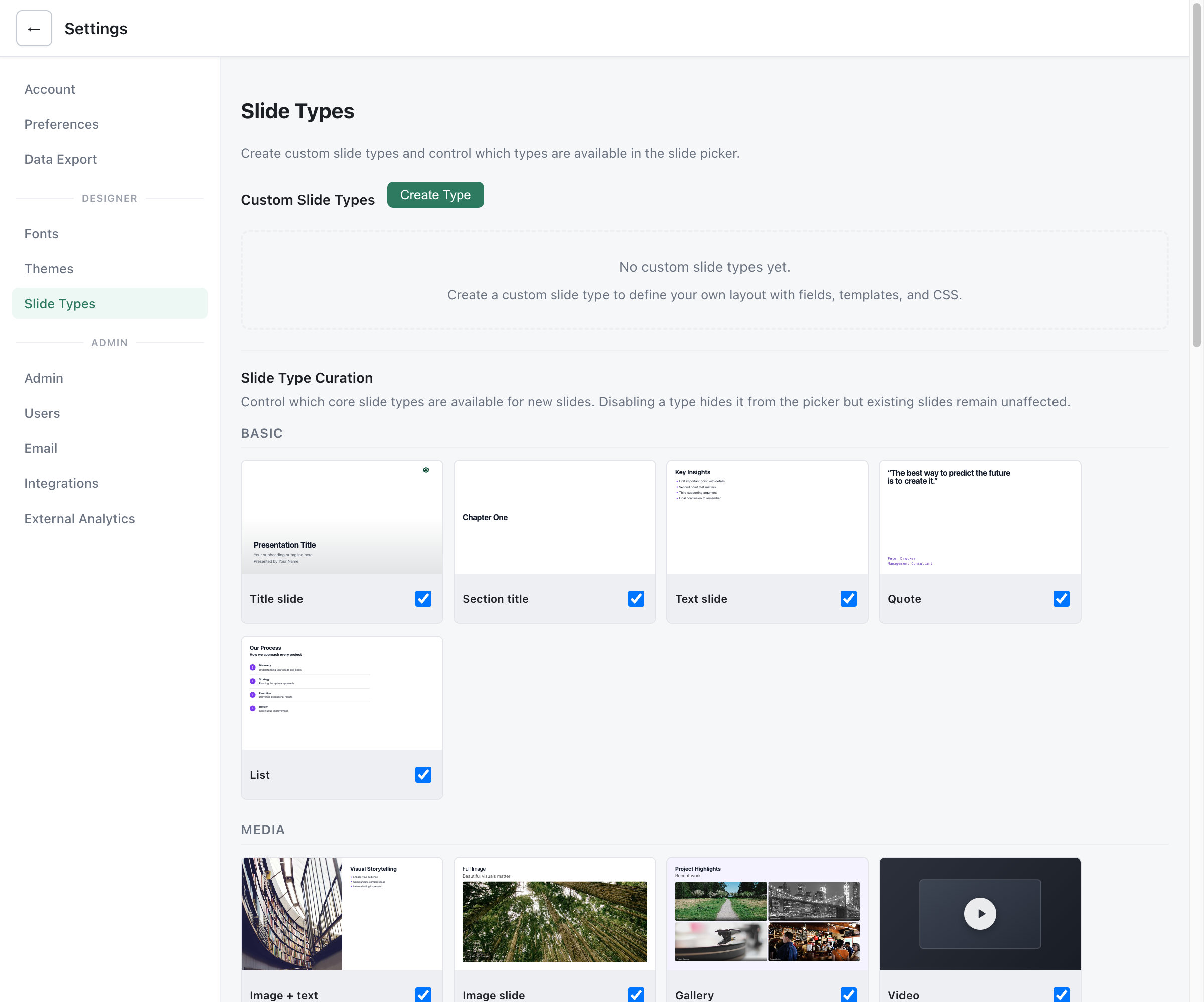
Section titled “Overview”Deckyard’s slide type system is extensible, allowing you to create custom slide types for your specific needs. Custom slide types live in the /custom-slide-types/ directory and are automatically loaded at startup.
File Structure
Section titled “File Structure”Directory Location
Section titled “Directory Location”deckyard/├── custom-slide-types/│ ├── my-custom-slide.js│ ├── team-profile.js│ └── product-showcase.js└── ...File Naming
Section titled “File Naming”- Use kebab-case:
my-slide-type.js - Filename becomes the type name:
my-slide-type - Files starting with
_are skipped (helpers) - Only
.jsfiles are loaded
Basic Structure
Section titled “Basic Structure”Minimal Example
Section titled “Minimal Example”export default { label: 'My Custom Slide', fields: [], renderHtml(content) { return '<div class="slide">Hello World</div>'; }};Required Properties
Section titled “Required Properties”| Property | Type | Description |
|---|---|---|
label | string | Display name in slide picker |
renderHtml | function | Returns HTML string |
Optional Properties
Section titled “Optional Properties”| Property | Type | Description |
|---|---|---|
fields | array | Editable field definitions |
defaults | object | Default values for fields |
icon | string | Icon name for slide picker |
category | string | Category grouping |
Fields Configuration
Section titled “Fields Configuration”Field Definition
Section titled “Field Definition”fields: [ { key: 'title', label: 'Title', type: 'string', default: 'Untitled' }, { key: 'description', label: 'Description', type: 'markdown' }, { key: 'image', label: 'Background Image', type: 'image' }]Field Types
Section titled “Field Types”| Type | Editor Control | Example Value |
|---|---|---|
string | Text input | "Hello" |
markdown | Rich text editor | "**Bold** text" |
image | Image picker | "/uploads/img.jpg" |
images | Image gallery | ["/img1.jpg", "/img2.jpg"] |
boolean | Toggle switch | true |
select | Dropdown | "option1" |
number | Number input | 42 |
color | Color picker | "#ff0000" |
Select Field Options
Section titled “Select Field Options”{ key: 'layout', label: 'Layout', type: 'select', options: [ { value: 'left', label: 'Left aligned' }, { value: 'center', label: 'Centered' }, { value: 'right', label: 'Right aligned' } ], default: 'center'}The renderHtml Function
Section titled “The renderHtml Function”Signature
Section titled “Signature”renderHtml(content, slide, ctx) { // content: Field values from user // slide: Full slide object (id, type, content) // ctx: Rendering context (theme, locale, etc.)
return '<div>...</div>';}Parameters
Section titled “Parameters”| Parameter | Description |
|---|---|
content | Object with field values |
slide | Complete slide object |
ctx | Context: theme, followCodes, locale |
Escaping HTML
Section titled “Escaping HTML”Use the helper to prevent XSS:
import { esc } from '../shared/slide-types/helpers.js';
renderHtml(content) {  return `<h1>${esc(content.title)}</h1>`;}
Full Example
Section titled “Full Example”import { esc } from '../shared/slide-types/helpers.js';
export default { label: 'Team Profile', fields: [ { key: 'name', label: 'Name', type: 'string', default: '' }, { key: 'role', label: 'Role', type: 'string', default: '' }, { key: 'photo', label: 'Photo', type: 'image' }, { key: 'bio', label: 'Biography', type: 'markdown' } ], renderHtml(content) { const photoHtml = content.photo ? `<img src="${esc(content.photo)}" alt="${esc(content.name)}" class="profile-photo" />` : '';
return ` <div class="slide slide-team-profile"> <div class="profile-card"> ${photoHtml} <h1>${esc(content.name)}</h1> <p class="role">${esc(content.role)}</p> <div class="bio">${content.bio}</div> </div> </div> `; }};Styling Custom Slides
Section titled “Styling Custom Slides”Using Existing Classes
Section titled “Using Existing Classes”Leverage built-in slide classes:
renderHtml(content) { return ` <div class="slide slide-center"> <div class="slide-inner"> <h1 class="slide-title">${esc(content.title)}</h1> </div> </div> `;}Custom CSS
Section titled “Custom CSS”Add styles via a companion CSS file or inline:
renderHtml(content) { return ` <style> .my-custom-slide .feature-grid { display: grid; grid-template-columns: repeat(3, 1fr); gap: 2rem; } </style> <div class="slide my-custom-slide"> <div class="feature-grid">...</div> </div> `;}Theme Integration
Section titled “Theme Integration”Access theme variables in your styles:
.my-custom-slide { background: var(--t-background); color: var(--t-text);}Multi-Language Support
Section titled “Multi-Language Support”Static Translations
Section titled “Static Translations”const COPY = { nl: { title: 'Welkom' }, 'en-GB': { title: 'Welcome' }};
export default { label: 'Welcome Slide', fields: [], renderHtml(content, slide, ctx) { const lang = ctx?.locale || 'en-GB'; const copy = COPY[lang] || COPY['en-GB']; return `<h1>${esc(copy.title)}</h1>`; }};User Content Translation
Section titled “User Content Translation”String and markdown fields are automatically included in Deckyard’s translation workflow.
Defaults
Section titled “Defaults”Setting Defaults
Section titled “Setting Defaults”export default { label: 'Feature Slide', fields: [ { key: 'title', type: 'string' }, { key: 'layout', type: 'select', options: [...] } ], defaults: { title: 'New Feature', layout: 'grid' }};Loading Custom Types
Section titled “Loading Custom Types”Automatic Loading
Section titled “Automatic Loading”On server startup:
/custom-slide-types/scanned for.jsfiles- Each file dynamically imported
- Default export validated
- Type registered with slide system
Logging
Section titled “Logging”Check console for load status:
[custom-loader] Loaded custom slide type: team-profile[custom-loader] Loaded custom slide type: product-showcaseErrors
Section titled “Errors”If a type fails to load:
[custom-loader] Skipping broken-slide.js: missing 'label' property[custom-loader] Error loading bad-code.js: SyntaxError: ...Best Practices
Section titled “Best Practices”Keep It Simple
Section titled “Keep It Simple”- Focus on single-purpose slides
- Reuse existing styling where possible
- Don’t over-engineer
Accessibility
Section titled “Accessibility”- Use semantic HTML
- Include alt text for images
- Ensure color contrast
- Support keyboard navigation
Performance
Section titled “Performance”- Avoid heavy JavaScript in renders
- Optimize images
- Keep HTML clean and minimal
Maintainability
Section titled “Maintainability”- Document your slide types
- Use consistent naming
- Test with different content lengths
Deployment
Section titled “Deployment”Git Strategy
Section titled “Git Strategy”For forks:
/custom-slide-types/tracked in fork- Ignored in upstream OSS repo
- Merge conflicts rare
Updates
Section titled “Updates”When updating from upstream:
- Custom slides are preserved
- Core slide types may change
- Test custom slides after updates
Troubleshooting
Section titled “Troubleshooting”Slide Not Appearing
Section titled “Slide Not Appearing”- Check file is in correct directory
- Verify file extension is
.js - Check for syntax errors
- Ensure default export exists
Fields Not Showing
Section titled “Fields Not Showing”- Verify field definitions
- Check
keyis unique - Ensure
typeis valid
Rendering Issues
Section titled “Rendering Issues”- Check browser console for errors
- Verify HTML is valid
- Test with minimal content first