

Layout Slides
The Layouts shelf of the slide-type picker holds slides that arrange content in blocks and sequences: text blocks, icon cards, process steps and timelines. Every field, with its limits, is in the slide-type reference.
Image blocks (team photos) and logo walls are on the Media shelf; see Media Slides. Quotes and callouts are on the Basic shelf; see Basic & Closing Slides.
Text Blocks
Section titled “Text Blocks”Rows of labelled text blocks (text-blocks-slide), for pillars, building blocks or a layered model.
| Field | Required | Description |
|---|---|---|
title | Yes | Slide title (max 120 chars) |
subheading, bottomSubheading | No | Text above and below (max 200 chars each) |
rows | No | 1-4 rows (see below) |
headerAlign | No | center (default) or left |
Each row has an optional heading, a colour (yellow or black), 1-6 blocks with a title (max 80 chars) and Markdown body (max 500 chars), and an optional arrow after it (down or up) to show how one row leads to the next.
Icon Cards
Section titled “Icon Cards”Cards with an icon, a title and a short text (icon-card-grid-slide).
| Field | Required | Description |
|---|---|---|
title | Yes | Slide title (max 120 chars) |
subheading, bottomSubheading | No | Text above and below (max 200 chars each) |
layout | No | cards or tiles |
items | No | 1-6 cards (see below) |
Each card has:
icon- An icon from the built-in Lucide settitle- Card heading (max 80 chars)body- Card text in Markdown (max 700 chars)link- Optional URL;#slide:<id>or#Njumps to a slide in the deck
Process
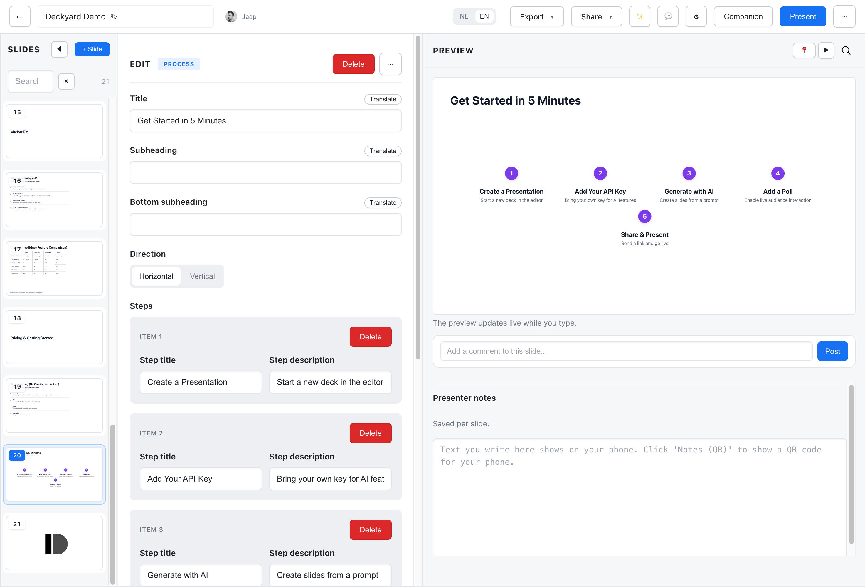
Section titled “Process”Sequential steps with arrows between them (process-slide).
| Field | Required | Description |
|---|---|---|
title | Yes | Slide title (max 120 chars) |
subheading, bottomSubheading | No | Text above and below (max 200 chars each) |
items | Yes | 3-7 steps, each a title (max 60 chars) and optional text (max 200 chars) |
direction | No | horizontal (default) or vertical |
background | No | lime or mist |
Steps are numbered automatically in the order you add them.
Timeline
Section titled “Timeline”Events along a timeline (timeline-slide).
| Field | Required | Description |
|---|---|---|
title | No | Slide title (max 120 chars) |
subheading, bottomSubheading | No | Text above and below (max 200 chars each) |
items | Yes | 2-10 events (see below) |
background | No | lime or mist |
Each event has a date or label (max 30 chars), a title (max 60 chars) and an optional text (max 200 chars). The date field takes any label, so a timeline also works as a meeting agenda with time slots.
Best Practices
Section titled “Best Practices”- Keep the number of cards and blocks modest; four to six reads best.
- Keep card and block titles short, and put the detail in the body text.
- Use a process for steps that follow from each other, and a timeline for moments in time.