

Slide Types Overview
Deckyard includes 35 built-in slide types. Each slide type has its own fields, defaults and rendering behavior; the guides below say what each one is for, and the slide-type reference lists every field with its limits and options.
Categories
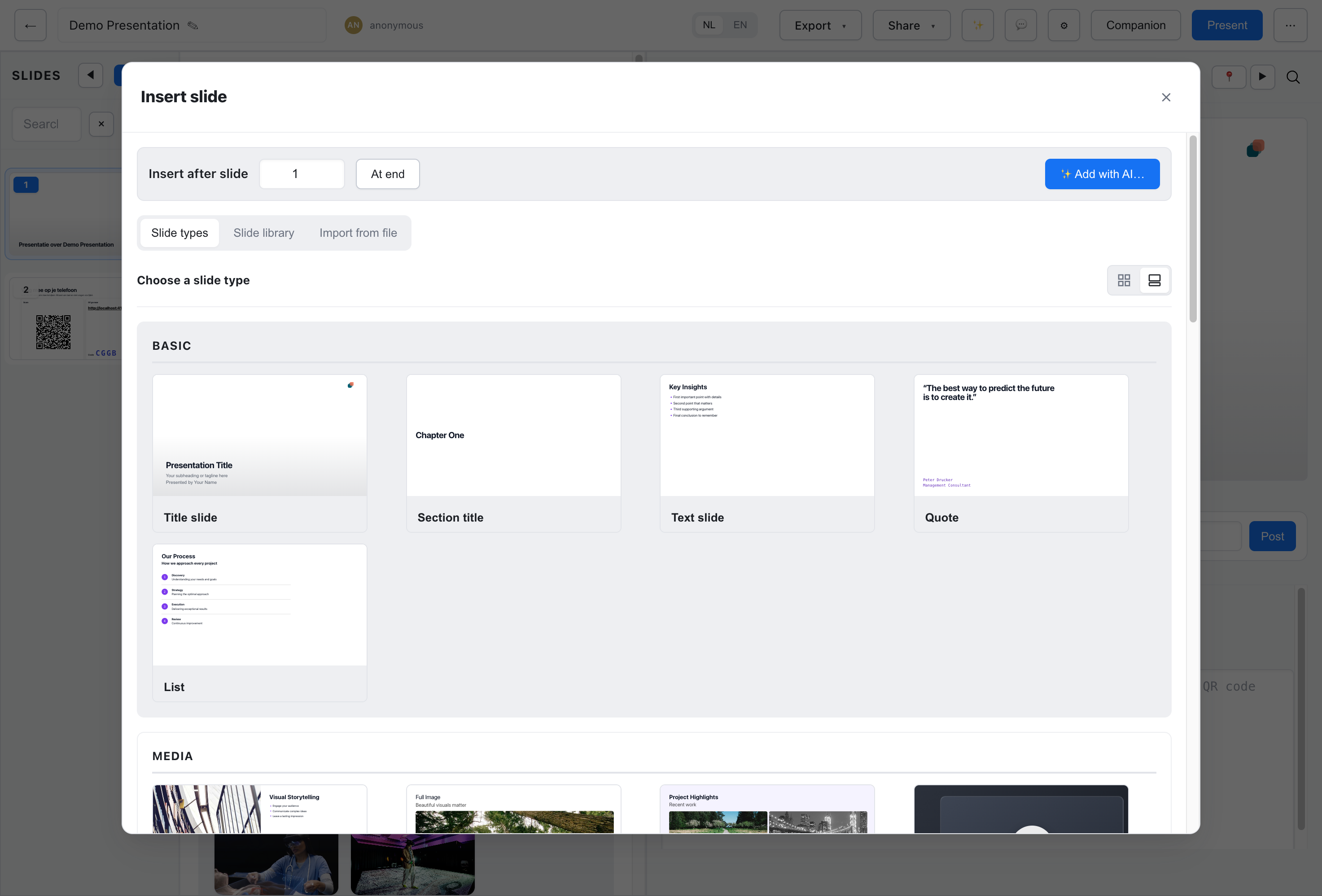
Section titled “Categories”The slide-type picker groups the types on six shelves. Above them it can show your pinned and frequently used types, your slide libraries, and a Custom shelf when your instance has custom slide types. A theme can also put its own preferred types at the front of Basic.
Title, text and emphasis. See Basic & Closing Slides.
- Title slide - Big title and subtitle to open with
- Section title - Section divider between topics
- Text slide - A heading with Markdown body text
- Quote - A pull quote with attribution
- List - A bulleted or numbered list
- Callout - One insight, warning or definition on its own slide
Images, video and embeds. See Media Slides.
- Image + text - An image beside text
- Images + text - Two or three images with text
- Image slide - A single full-bleed image
- Gallery - A grid of images
- Video - An embedded YouTube, Vimeo or Bunny Stream video
- Embed - An external page in an iframe
- Image blocks - Image blocks in a grid, such as team photos
- Logo wall - A wall of logos
Layouts
Section titled “Layouts”Structured content in blocks and sequences. See Layout Slides.
- Text blocks - Rows of labelled text blocks
- Icon cards - Cards with an icon and label
- Process - Sequential steps with arrows
- Timeline - Events along a timeline
Tables, charts and frameworks. See Data & Visualization Slides.
- Table - A data table
- Chart - A bar, line or pie chart
- KPI - Big numbers with deltas
- Comparison - Two options side by side
- Matrix - A 2×2 quadrant matrix
- Funnel - Stages narrowing to a goal
- Pyramid - A layered hierarchy pyramid
- Cycle - A repeating cycle of stages
Interaction
Section titled “Interaction”Slides for live sessions with an audience. See Interactive Slides.
- Poll - A live audience poll
- Likert - An agree/disagree rating
- Likert slider - A 1-10 slider rating
- Feedback - Open text feedback
- Follow-along invite - A QR code to follow along
- Countdown timer - A countdown the presenter starts and pauses
Closing slides and free-form markup. See Basic & Closing Slides.
- End / Contact - A closing slide with contact details
- Custom HTML - Your own HTML and CSS, for anything else
- Payoff - The theme’s payoff logo as a closing beat
Fields Every Type Carries
Section titled “Fields Every Type Carries”Besides its own fields, every slide type accepts the same accessibility, background and logo fields:
| Field | Description |
|---|---|
a11yTitle | Accessibility title, announced by screen readers when the slide becomes active (max 140 chars) |
a11ySummary | Additional context for screen readers (max 280 chars) |
slideBgImage | Background image behind the slide, with slideBgFit, slideBgFocusX/slideBgFocusY, slideBgOverlay and slideBgText to fit it and keep text readable |
slideLogo | Whether the theme logo shows in the top-right corner |
Most types also have a background field that picks between the theme’s lime and mist surfaces. The full list is under Fields every type carries.
Text is rendered with dir="auto" in the slide renderers, so right-to-left languages display in the right direction.
Custom Slide Types
Section titled “Custom Slide Types”Organizations can add their own slide types in the custom/slide-types/ directory of an instance. A custom type can add a new slide type or override a core one. See Custom Slide Types for details.