

Data & Visualization Slides
The Data shelf of the slide-type picker holds tables, charts, key figures, comparisons and four framework diagrams. Every field, with its limits, is in the slide-type reference.
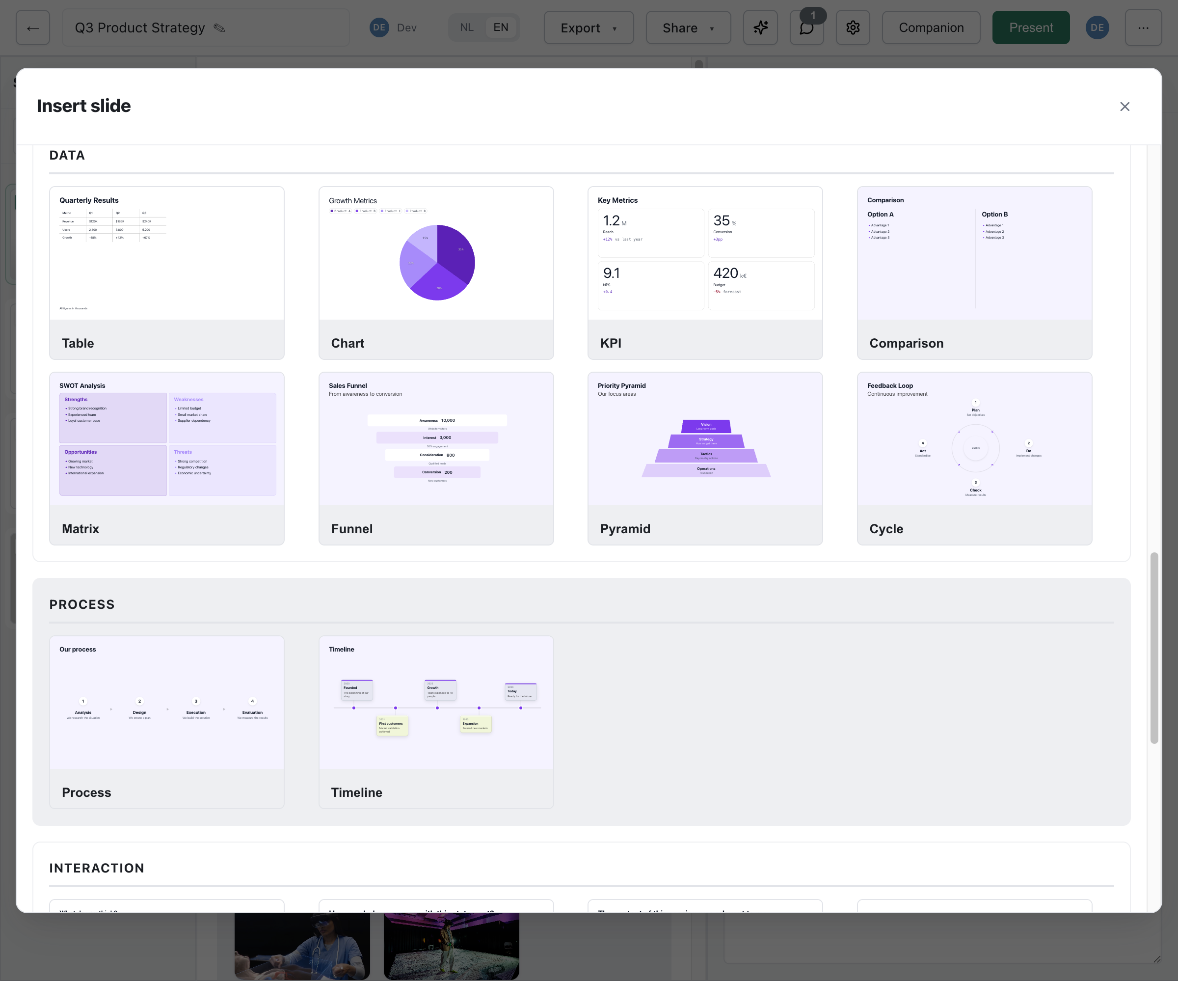
Table Slide
Section titled “Table Slide”Structured data in a table of up to 10 columns and 40 rows (table-slide).
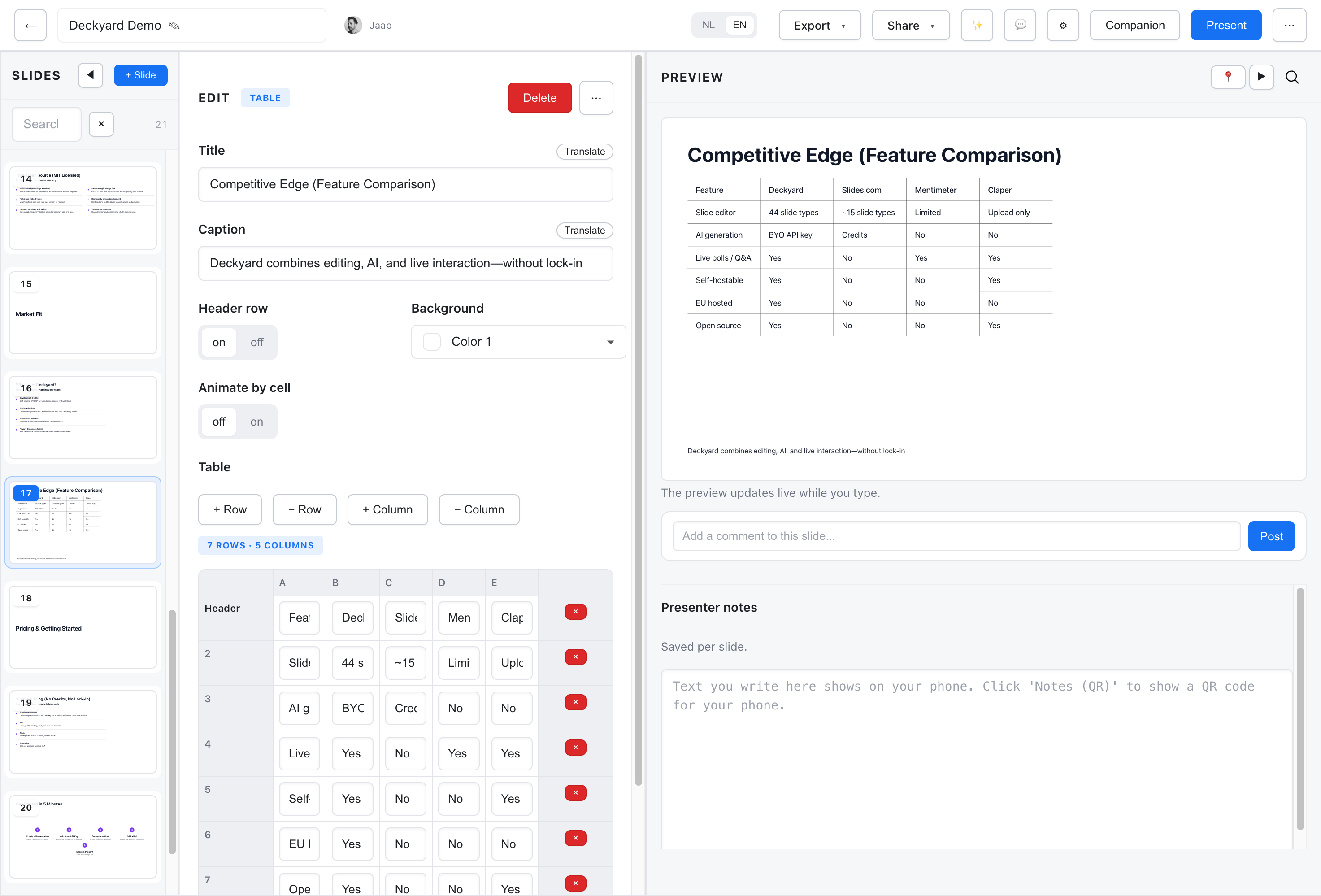
| Field | Required | Description |
|---|---|---|
title | Yes | Table title (max 120 chars) |
caption | No | Caption or footnote (max 240 chars) |
headerRow | No | Style the first row as a header: on or off |
tableStyle | No | plain, panel or soft |
cornerCell | No | Treat the top-left cell as a row label or a header |
animateByCell | No | off (reveal row by row) or on (cell by cell) |
rows | No | Up to 40 rows; add and remove columns in the grid |
background | No | lime or mist |
Cells support inline Markdown: bold, italic and links. When presenting, the table reveals step by step, row by row unless animateByCell is on.
Chart Slide
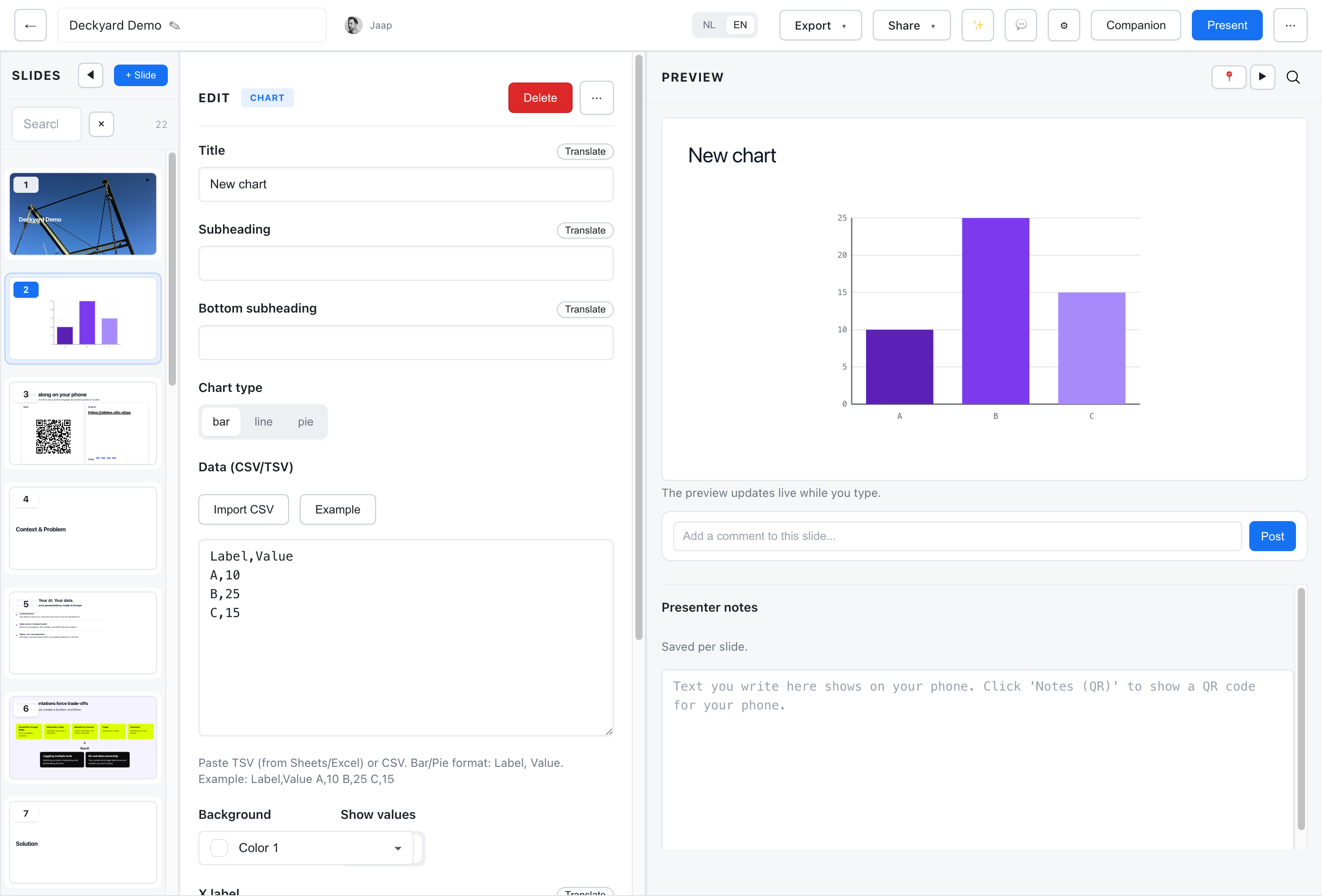
Section titled “Chart Slide”Bar, line and pie charts from CSV or TSV data (chart-slide).
| Field | Required | Description |
|---|---|---|
title | Yes | Chart title (max 120 chars) |
subheading | No | Subtitle below the title (max 220 chars) |
bottomSubheading | No | Text at the bottom of the slide |
chartType | Yes | bar (default), line or pie |
data | Yes | CSV or TSV data |
xLabel, yLabel | No | Axis labels (bar and line) |
showValues | No | Show values on the bars: yes or no (bar) |
series1Label, series2Label | No | Legend labels (line) |
showLegend | No | yes or no (line and pie) |
pieLabelMode | No | none, value, % (default) or both (pie) |
headerAlign | No | left or center |
background | No | lime or mist |
The editor only shows the options that apply to the chosen chart type.
Data Format
Section titled “Data Format”Enter data as CSV (comma-separated) or TSV (tab-separated):
Label,ValueQ1,100Q2,150Q3,125Q4,200A line chart takes one or two series:
Month,Sales,CostsJan,100,80Feb,120,85Mar,140,90KPI Metrics Slide
Section titled “KPI Metrics Slide”Key figures as large numbers with units and a short note (kpi-metrics-slide, KPI in the picker).
| Field | Required | Description |
|---|---|---|
title | No | Slide title (max 120 chars) |
subheading, bottomSubheading | No | Text above and below (max 200 chars each) |
metrics | No | 1-4 metrics (see below) |
accent | No | none, highlight-best or highlight-risk |
countUp | No | Count the numbers up when presenting: off or on |
headerAlign | No | left or center |
background | No | lime or mist |
Each metric has a value (e.g. “1.2”, max 30 chars), a unit (e.g. “M”, ”%”, “k€”), a label (e.g. “Revenue”) and a note (e.g. “+12% vs last year”, max 100 chars).
Positive and Negative Notes
Section titled “Positive and Negative Notes”A note that starts with a signed number gets a tone: +12% is shown as positive, -5% or −5% as negative, in the theme’s colours. The rest of the note stays neutral.
Count-up only runs when presenting and in follow mode, not in the editor preview.
Comparison Slide
Section titled “Comparison Slide”Two options side by side (comparison-slide).
| Field | Required | Description |
|---|---|---|
title | No | Slide title (max 120 chars) |
subheading, bottomSubheading | No | Text above and below (max 200 chars each) |
leftTitle, rightTitle | Yes | Column headings (max 100 chars each) |
leftBody, rightBody | Yes | Column content in Markdown (max 2000 chars each) |
variant | No | versus (default), before-after, pros-cons or tradeoff |
verdict | No | Optional badge text (max 100 chars) |
background | No | lime or mist |
Use it for before/after, pros and cons, or an old way against a new way.
Matrix Slide
Section titled “Matrix Slide”A 2×2 quadrant matrix with exactly four cells (matrix-slide). A new matrix starts as a SWOT analysis.
Each cell has a title (max 40 chars), Markdown body (max 1000 chars) and a tone: default, positive, negative or neutral. The slide also takes an optional title, subheading and bottom subheading.
Use cases: SWOT, the Eisenhower matrix (urgent/important), risk grids, competitive positioning.
Funnel Slide
Section titled “Funnel Slide”Stages narrowing to a goal (funnel-slide): 3-6 stages, each with a label (max 60 chars), an optional value such as a count or percentage (max 30 chars) and a short text (max 120 chars). The title is required.
Use cases: sales funnels, conversion rates, user journeys.
Pyramid Slide
Section titled “Pyramid Slide”A layered hierarchy (pyramid-slide): 3-6 levels, each with a label (max 60 chars) and a short text (max 120 chars). The title is required.
Use cases: hierarchies of needs, priority frameworks, from vision to daily work.
Cycle Slide
Section titled “Cycle Slide”A repeating cycle of stages (cycle-slide): 3-6 stages, each with a label (max 40 chars) and a short text (max 80 chars), around an optional centerLabel (max 60 chars). The title is required.
Use cases: plan-do-check-act, feedback loops, iterative workflows.