

Accessibility
Deckyard includes features to make presentations accessible to all audiences.
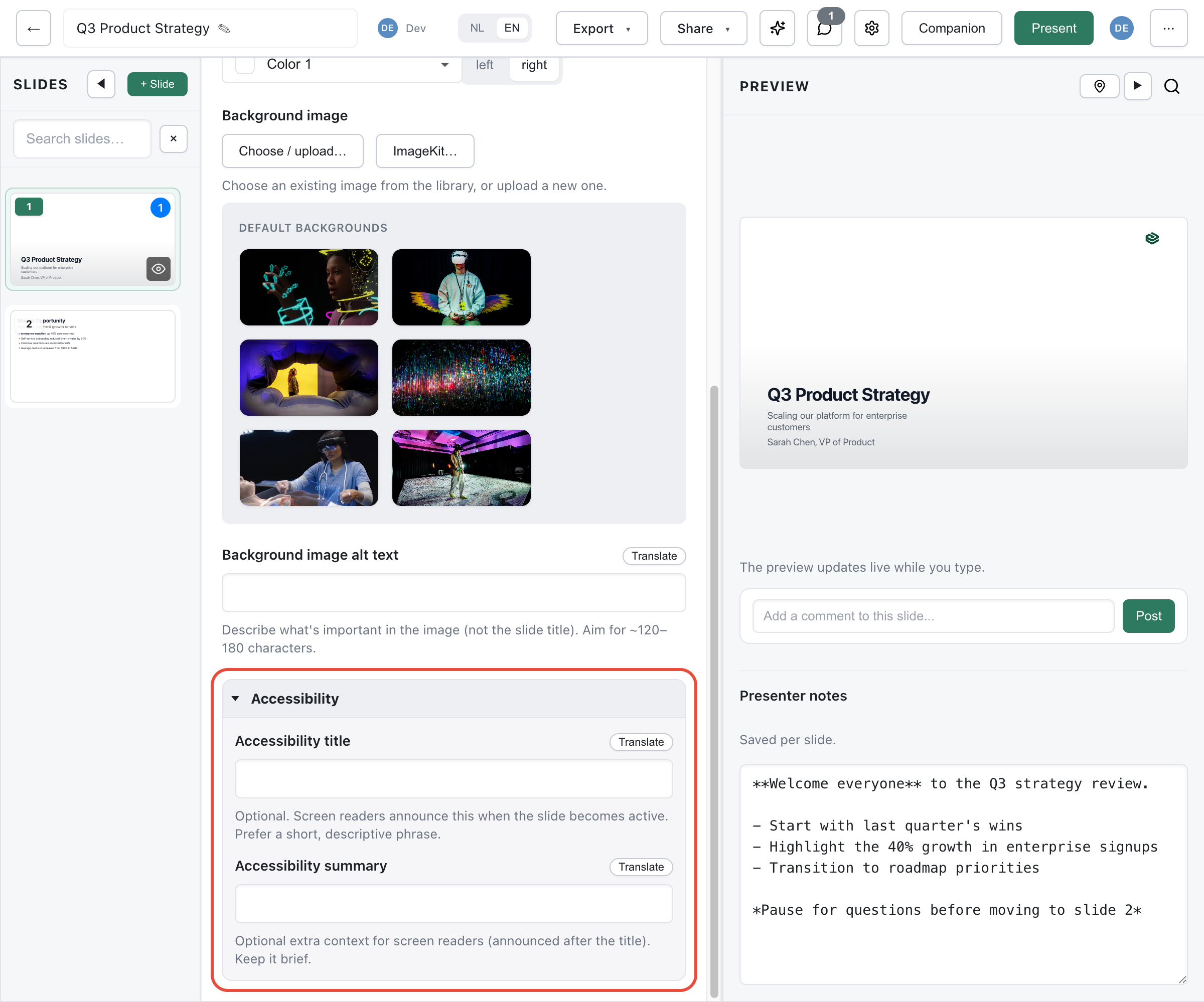
A11y Title
Section titled “A11y Title”Each slide can have an accessibility title that’s announced by screen readers when the slide becomes active.
- Set via the A11y Title field on each slide
- Keep it descriptive but concise
- Example: “Quarterly revenue chart showing 15% growth”
A11y Summary
Section titled “A11y Summary”For complex slides, add an accessibility summary providing additional context:
- Describes what the slide contains
- Useful for data visualizations, charts, and images
- Read by assistive technology
Image Alt-Text
Section titled “Image Alt-Text”Every image should have alt-text:
- When adding an image, fill in the Alt Text field
- Provide both NL and EN versions for bilingual presentations
- Describe what the image shows, not just “image of…”
AI Alt-Text
Section titled “AI Alt-Text”Use AI to generate alt-text automatically:
- Click Generate Alt-Text on an image
- AI creates descriptions in both languages
- Review and refine as needed
See AI Alt-Text for details.
Keyboard Navigation
Section titled “Keyboard Navigation”The presenter mode supports full keyboard navigation:
| Key | Action |
|---|---|
| Arrow keys | Navigate slides |
| Home/End | First/last slide |
| F | Fullscreen |
| Escape | Exit |
Color Contrast
Section titled “Color Contrast”The theme editor reports contrast, it does not enforce it. Every color pair it produces carries a ratio and a WCAG verdict, and a theme with a failing pair can still be saved.
Deckyard derives a text color for you: pick a background or accent color and you get light or dark text against it automatically. That choice is made by measuring both candidates and taking the higher contrast ratio, so the color that reads wins over the color that looks logical. Because contrast is not symmetric around the middle of the brightness range, mid-light backgrounds get dark text.
In the theme editor the numbers sit next to the pickers that produced them: a row per background variant, and a readout under the main colors grid for the pairs those four pickers imply. Each shows the ratio and a WCAG 2.2 verdict - fail, AA or AAA - against the threshold for the text size in that role, so buttons and headings are judged as large text at 3:1 and body copy against the stricter 4.5:1. An APCA Lc value is shown beside it as a second reading. WCAG is the verdict, because it is what EN 301 549 and the European Accessibility Act reference; APCA models perceived contrast better, especially light text on dark, but never decides.
The ratio is there whether the pair passes or not, so contrast is a property you can steer toward rather than an alarm that only appears once you are already past the line.
Contrast is also measured on a slide background image. The editor samples the region where the title sits, picks whichever of the theme’s two text colors reads better over it, and adds a scrim when neither clears the 3:1 target for large text. That happens automatically and is stored on the slide, so exports and PDF renders make the same decision.
What the readout does not cover is the brand palette, which carries no verdicts yet. And a verdict on a pair is not a verdict on a deck: the reading view of a published presentation is the easiest surface to test the whole thing against, because it is plain HTML in whatever contrast checker you already use.
Reading View
Section titled “Reading View”Every published presentation also has a reading view: the same content projected as a document rather than a fixed 16:9 canvas.
- Reachable at
/readerafter the presentation’s public URL (/p/<id>-<slug>/reader), and linked from the presentation itself - On the open web with no login, like the presentation it belongs to
- Readable with JavaScript disabled, and with the page’s own stylesheet disabled
What it produces:
| Content | Becomes |
|---|---|
| The presentation | One <h1>, plus a table of contents and <header> / <nav> / <main> landmarks |
| Each slide | An <h2>, from the slide’s title field or its accessibility title |
| A collection whose order carries meaning (timeline, process) | An ordered list, <ol> |
| A collection whose order is incidental (cards, columns) | An unordered list, <ul> |
| A table field | A <table> with <thead> and <th scope="col"> |
| An image marked as content | A <figure> with its alt text, plus <figcaption> when there is a caption |
| An image marked as decorative | Empty alt and aria-hidden, so assistive technology skips it |
| Appearance-only fields (colors, sizes, layout choices) | Nothing: they are not content |
The projection is generated from the declared field vocabulary rather than written per slide type, so a custom slide type appears in the reading view without extra work, and the output cannot drift from the type definitions.
The layout uses relative units and a single column, so it reflows on a narrow screen instead of scaling down. The canvas view is unchanged and remains the presentation surface: these are two projections of the same slide records, not an original and a copy that has to be kept in sync.