

Media Slides
The Media shelf of the slide-type picker holds everything built around images, video and external content. Every field, with its limits, is in the slide-type reference.
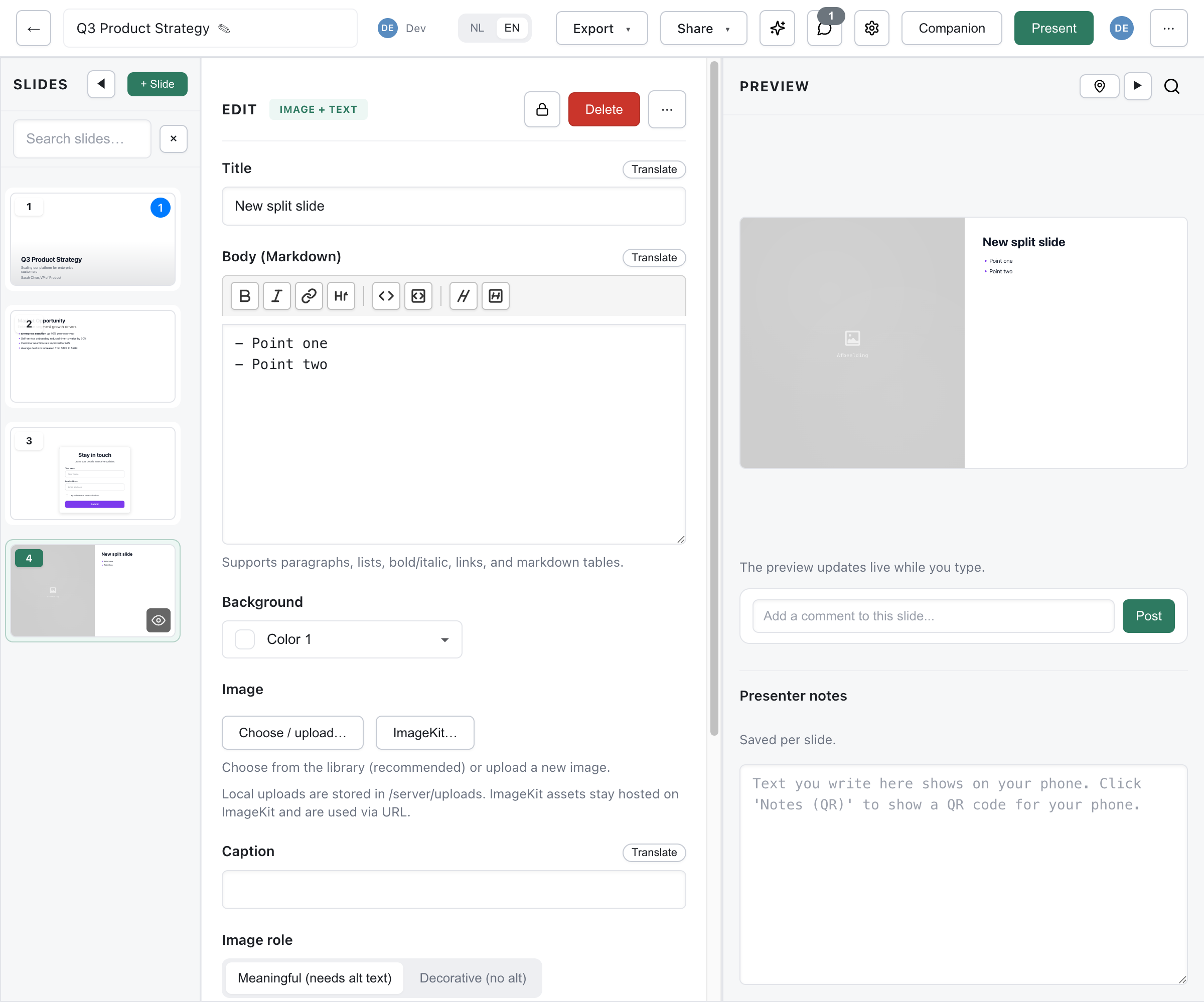
Image + Text
Section titled “Image + Text”One image beside Markdown text (image-text-slide). The picker offers it as four ready layouts: Image left, Image right, Image 2/3 and Corner image.
| Field | Required | Description |
|---|---|---|
title | Yes | Slide title (max 120 chars) |
body | Yes | Body text in Markdown (max 3000 chars) |
image | No | The image |
imageRole | No | content (default) or decorative |
alt | No | Alt text for a content image (max 180 chars) |
caption | No | Caption (max 160 chars) |
layout | No | split (default) or corner |
imageSide | No | left (default) or right |
imageWidth | No | half (default), narrow or wide |
fit | No | cover (crop to fill) or contain (show the whole image) |
imageBackground | No | Colour behind a contained image: white or match |
density, asideVariant, asideText, actions, background | No | As on the Text slide |
Drag on the image in the editor to set its focus point, the part that stays visible when the image is cropped. The layout switcher can also turn the slide into an Images + text slide or back into a text-only Text slide.
Images + Text
Section titled “Images + Text”Two or three images with text (image-set-slide).
| Field | Required | Description |
|---|---|---|
title | Yes | Slide title (max 120 chars) |
body | Yes | Body text in Markdown (max 3000 chars) |
images | Yes | 2-3 images, each with its own alt text and fit |
layout | No | top (images in a row above the text, default), bottom (row below) or beside |
imageSide, imageWidth | No | Side and width of the images, for the beside layout |
textColumns | No | 1 or 2 |
caption, imageRole, imageBackground | No | As on Image + text |
density, asideVariant, asideText, actions, background | No | As on the Text slide |
Image Slide
Section titled “Image Slide”A single image filling the slide (image-slide).
| Field | Required | Description |
|---|---|---|
title | No | Title over the image (max 80 chars) |
subheading | No | Subtitle (max 140 chars) |
bottomSubheading | No | Text at the bottom (max 200 chars) |
image | No | The image |
imageRole | No | content or decorative |
alt | No | Alt text for a content image (max 180 chars) |
caption | No | Caption (max 160 chars) |
fit | No | cover (fill the frame, may crop, default) or contain (show the whole image) |
bleed | No | Edge-to-edge, without margins |
zoomSteps | No | Zoom preset for presenting (see below) |
zoomLevel | No | Zoom magnification (1.2-5, default 2) |
zoomPositions | No | Custom zoom positions (JSON) |
background | No | lime or mist |
With bleed on, the title and bottom text sit on top of the image. Older decks may still carry a layout value (full, bleed or centered); the editor converts it to fit and bleed when you touch the slide.
Focus Point
Section titled “Focus Point”Drag on the image in the editor to set the focus point (focusX, focusY, 0-100). It decides which part stays visible when a cover image is cropped, and how a contain image is aligned.
Zoom Steps (Presentation Mode)
Section titled “Zoom Steps (Presentation Mode)”Step through zoomed regions of the image while presenting:
| Preset | Description |
|---|---|
corners | Zoom to 4 corners |
horizontal | Left half, then right half |
vertical | Top half, then bottom half |
quadrants | Each quadrant in reading order |
custom | Define your own positions |
Custom zoom positions are percentages, specified as JSON:
[{"x":25,"y":25},{"x":75,"y":25},{"x":25,"y":75},{"x":75,"y":75}]Accessibility
Section titled “Accessibility”- Content images need meaningful alt text. Without it, Deckyard falls back to the caption, then the title or subtitle, then the file name.
- Decorative images are hidden from screen readers; they need no alt text.
Gallery
Section titled “Gallery”A grid of 2 to 6 images (gallery-slide).
| Field | Required | Description |
|---|---|---|
title | No | Gallery title (max 120 chars) |
subheading, bottomSubheading | No | Text above and below (max 200 chars each) |
layout | No | grid (default), masonry, or featured (one large image with smaller ones) |
images | Yes | 2-6 images, each with an optional caption (max 100 chars) and alt text |
background | No | lime or mist |
The grid adapts to the number of images.
An embedded video from YouTube, Vimeo or Bunny Stream (video-slide).
| Field | Required | Description |
|---|---|---|
title | No | Video title (max 100 chars) |
source | Yes | Video URL, or a Bunny embed URL or video ID |
autoplay | No | off (default) or on |
watchUrl | No | A readable link to the video, used in the PDF export |
bunnyLibraryId | No | Bunny Stream library ID for a bare video ID |
background | No | lime or mist |
Supported sources
- YouTube - Watch, short (
youtu.be), Shorts and embed URLs. Videos play fromyoutube-nocookie.com. - Vimeo - Standard and player URLs.
- Bunny Stream - An embed or play URL, or a video ID.
Autoplay
- Off (default) - The video waits until you press play.
- On - The video starts muted when the slide becomes active; browsers only allow autoplay without sound. A Bunny video also loops.
An external web page in an iframe (embed-slide).
| Field | Required | Description |
|---|---|---|
title | No | Embed title (max 120 chars) |
embedUrl | Yes | URL to embed, HTTPS only (max 500 chars) |
aspectRatio | No | 16:9 (default), 4:3, 1:1 or auto |
sandbox | No | restricted (default) or permissive |
background | No | lime or mist |
Security Considerations
Section titled “Security Considerations”- Restricted sandboxing blocks scripts and forms in the embedded page. Choose permissive only for a source you trust that needs scripts, forms or popups to work.
- Some sites block iframe embedding (
X-Frame-Options); they cannot be embedded. - Content loads directly from the source, not through your Deckyard server.
Image Blocks
Section titled “Image Blocks”Image blocks in a grid, such as team photos with names and roles (team-cards-slide). Up to 25 blocks per slide.
| Field | Required | Description |
|---|---|---|
title | No | Slide title (max 120 chars) |
subheading | No | Subtitle (max 220 chars) |
subheading2 | No | Subtitle for the right group, when the blocks are split |
bottomSubheading | No | Bottom text (max 200 chars) |
members | No | The blocks (see below) |
textPosition | No | below (name and caption under the image) or split (name above, caption below) |
imageShape | No | rounded (default), square or circle |
imageAspect | No | square (cropped, focus point decides) or original |
showPhotoFrame | No | off or on |
columnSplit | No | Split the grid into two groups after 1-5 columns |
background | No | lime or mist |
Each block has an image with alt text and a focus point, a name (max 80 chars), a byline caption (max 120 chars) and an optional linkedin URL.
Use columnSplit for two groups side by side, such as “Current team” and “New hires”, with subheading and subheading2 as their headings.
Logo Wall
Section titled “Logo Wall”Partner, client or sponsor logos in a grid (logo-wall-slide). Up to 30 logos.
| Field | Required | Description |
|---|---|---|
title | No | Slide title (max 120 chars) |
subheading | No | Description text (max 220 chars) |
logos | No | Up to 30 logos, each with an image, name, alt text and optional link |
headerAlign | No | left or center |
background | No | lime or mist |
The grid adapts to the number of logos, so the wall stays balanced from one logo to thirty.
Image Sources
Section titled “Image Sources”Every image field opens the same image library. There you can:
- Upload an image from your computer, or paste an Image URL
- Pick an image uploaded earlier by anyone in your organization
- Search Unsplash and Giphy, when your instance has them enabled
Depending on your instance, the image field can also offer built-in Gradients or your organization’s ImageKit archive.
Best Practices
Section titled “Best Practices”- Use high-resolution images (1920×1080 or more for full-slide images) in a sensible format: JPEG for photos, PNG or SVG for graphics.
- Set focus points on cropped images, so faces and subjects stay in frame.
- Keep videos short, and have a backup if the network at the venue is unreliable.
- Add alt text to every meaningful image; mark purely decorative images as decorative.